
We know where the Seattle Kraken rank in the league standings – at the top, undefeated, 1-and-0 going into Saturday’s 4 pm Seattle time road game against the Edmonton Oilers. But there’s all sorts of other rankings out there.
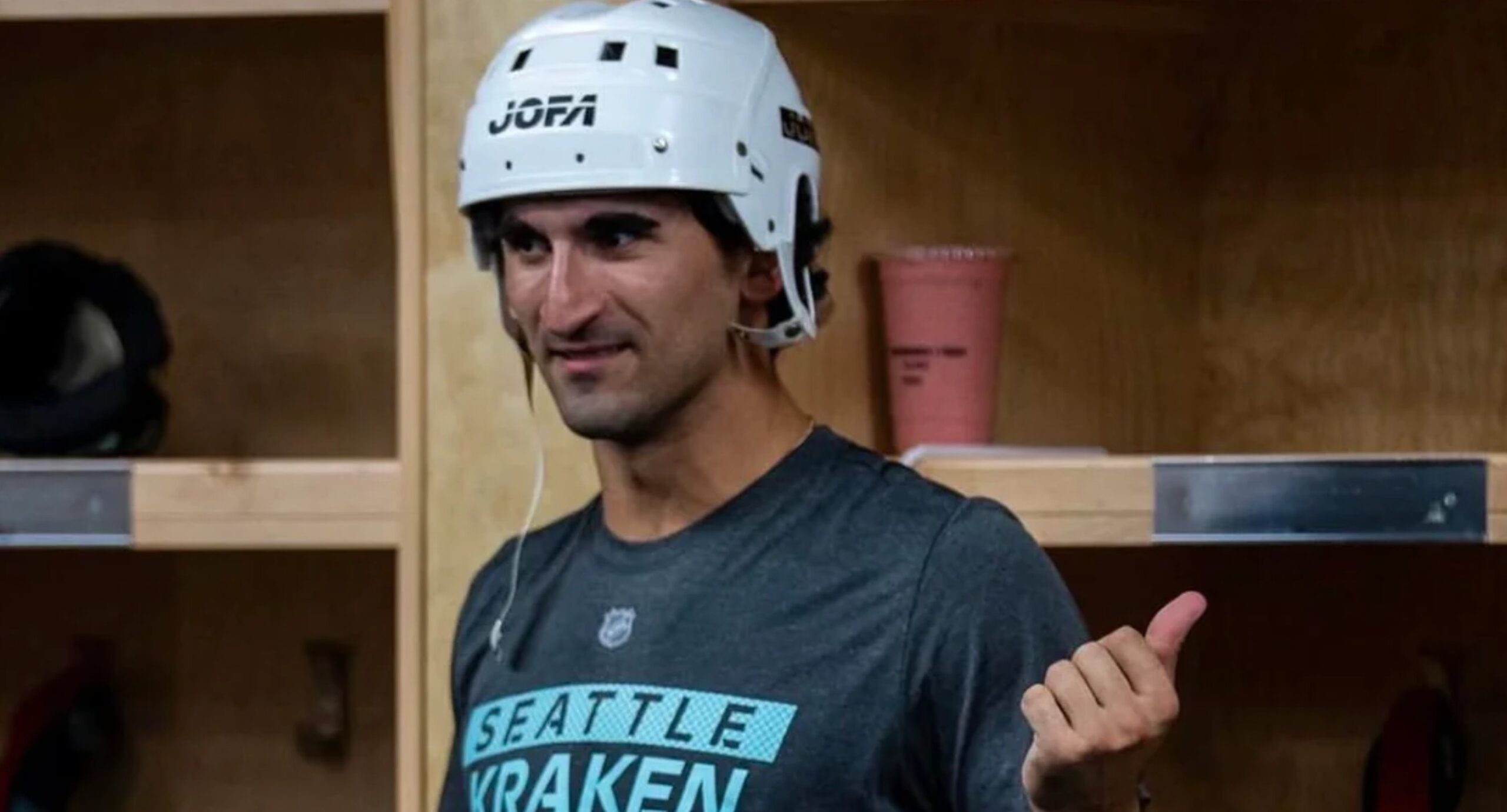
None of the rankings critique the Jofa helmet worn by Matty Beniers after Seattle’s opening-night victory Thursday in Calgary (featured image). For the time being, that goofy lid has replaced last season’s F1 helmet bestowed by teammates to the Kraken player of the game.
Kraken Center Ice Logo
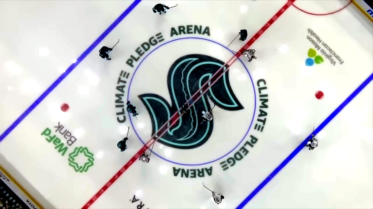
The Kraken “S” symbol comes in at #7 in Sportsnet.ca’s rundown of 2026-27 season center ice logos.
“The Kraken unveiled this logo last season and really haven’t had a reason to change. The deep blue and red colour combination gives the logo a completely different appearance from many of the league’s more traditional designs.
“Instead of the lighter logo that is used on the primary jersey, Seattle is embracing the way this darker theme really stands out. The Kraken crest also has enough detail to remain interesting.”
Here’s how a few other teams fared at the top and bottom of the rankings.
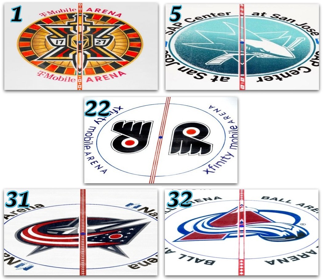
1. Vegas: “Rather than simply having the team’s standard shield, the design features a roulette wheel, the Golden Knights helmet crest, a sword, and a nod to 10 years in the league with the roman-numeral X.”
5. San Jose: “It’s nice to see San Jose try something new with their traditional logo. The fade in the colour on the centre-ice paint also avoids having the colour be too strong, and the white touches on the shark make it stand out nicely.”
22. Philadelphia: “The Flyers are the NHL’s lone team to feature the traditional double-logo design, instead of one oversized logo split down the middle. It’s a nice throwback touch, but it lacks punch.”
31. Columbus: “There’s nothing particularly wrong. It simply doesn’t have the same visual punch or creativity as other centre-ice designs.”
32. Colorado: “The design feels fairly conventional and lacks big-time appeal in comparison to other teams.”
Kraken Home & Road Uniforms
We’re calling a jersey foul on these rankings. How can Bleacher Report call Seattle’s home unis “superb,” and still rank them 26th? Here’s their attempt at an explanation.
“The navy-blue home sweater with the seafoam green and light blue stripes, along with that little touch of salmon red, makes us think of the ocean, and the Kraken logo is genuinely very good. The anchor shoulder logo with the outline of the Space Needle is wonderful as well. But their black alternate jersey with the green outline and menacing sleeve stripes is so much better.”
That’s like downgrading the chef’s impeccable lobster tails because his steak is so delicious. The low ranking for Seattle’s road uniform (#25) doesn’t match the praise for it, either.
“The Kraken have a solid and understated home and road set, and for a new team in the league to come in looking so fresh was a huge relief. With their logo front and center, huge on the white jersey, and the layers of blue, green, and red stripes up the sleeves, it gives us all the feel of the sea. With the anchor/Space Needle logo on the shoulders, it’s very Seattle without having to make use of Kurt Cobain or Jimi Hendrix.”
Beloved tradition-laden designs for the Red Wings (#18 home, #14 road) and Blackhawks (#8 for both) also don’t get the respect they’re used to. Montreal is rated the top home uniform, while Edmonton is #1 on the road.
The Capitals finished last both home and away. “There’s too much piping, colors in odd places, and a jersey design that detracts from the good elements. It’s just so needlessly busy.”
Earlier Kraken:
— Disciplined Kraken Could Find Success Vs. Oilers
Earlier Canucks:
— Canucks PR Poisons Writers Association
VIDEO: The 6-1 victory postgame “Kraken Reaction” …


