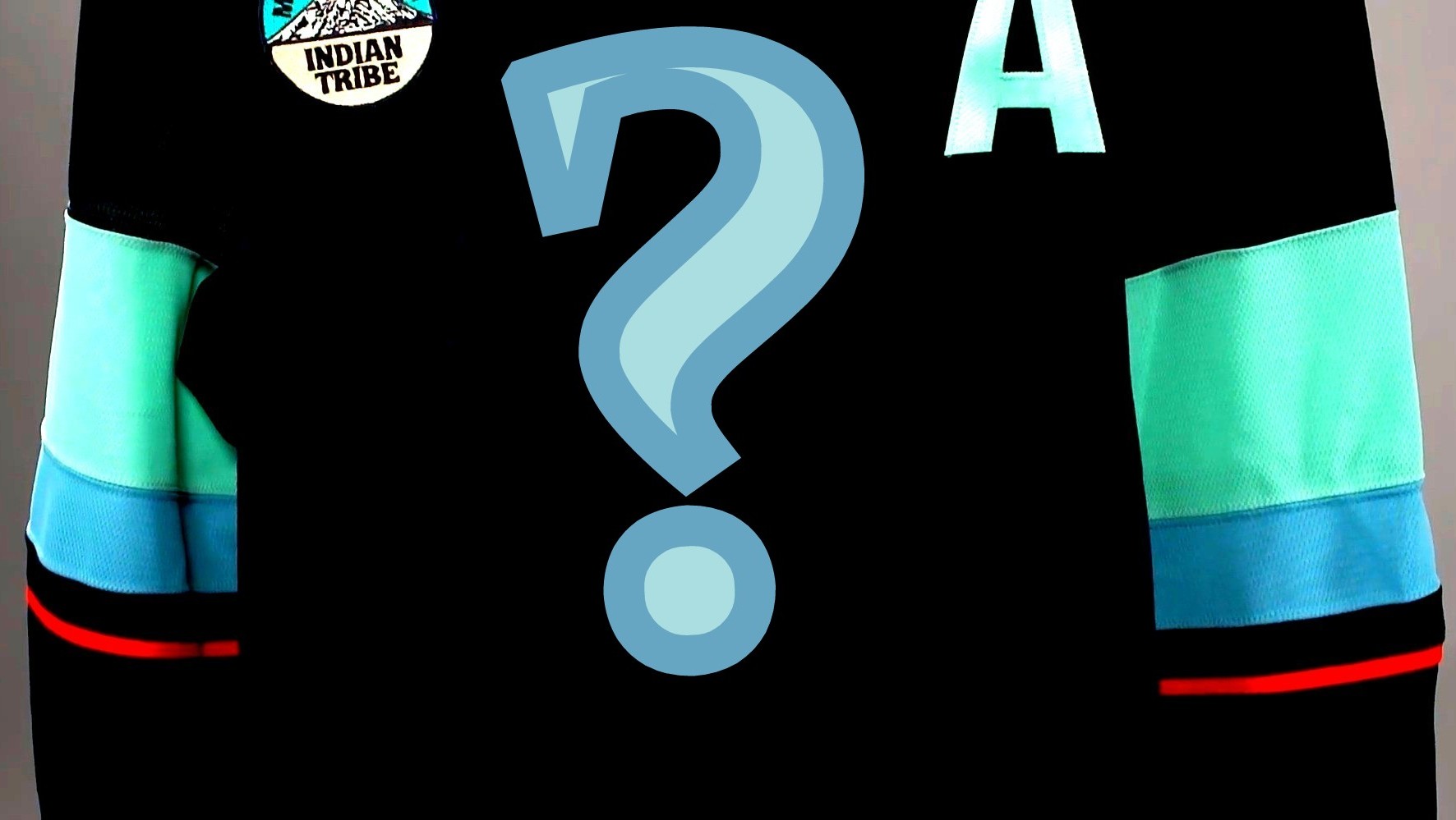

Let the speculation begin for what the latest Seattle Kraken uniform will look like.
According to a league press release, “All 32 NHL teams will feature a new look this season – special (‘Hometown Remix’) uniforms that celebrate the fans, city, and local culture of each team.”
Just last year, the Kraken unveiled their “Abyss” black jerseys. They’ve previously worn a Reverse Retro jersey and a Winter Classic variant, in addition to their usual home and road kits. The various outfits have been a hit with most, if not all, who’ve seen them.
Images purporting to be the Panthers and Islanders designs have already leaked. Although the “remix” jerseys won’t officially be revealed until after the season begins, SportsLogos.net has reported that navy blue will be among the colors utilized by the Kraken.
In the meantime, enterprising graphics designers and others have created what they hope those “city-connect” type uniforms should look like. Here are seven of the designs we’ve discovered so far.
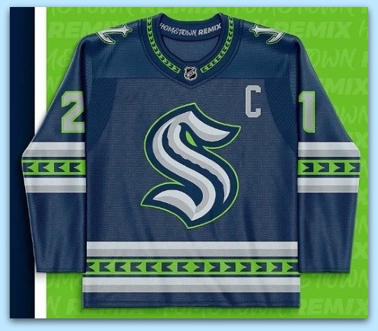
Seattle Seahawks Remix
This homage to the defending Super Bowl champions was created by Ivan Gajduko, who describes himself on his Instagram page with these two words: “Graphic Designer?”
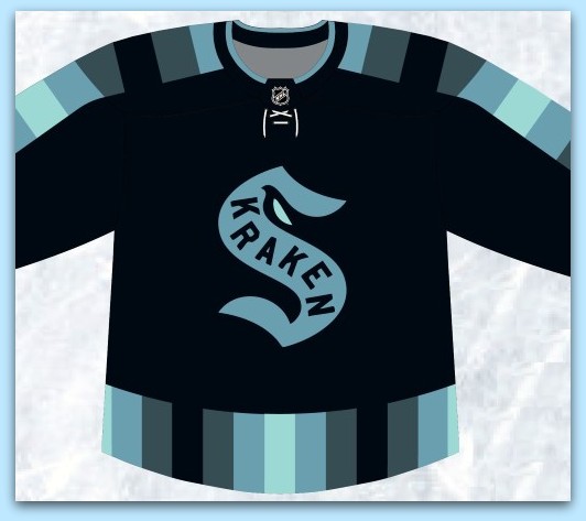
Seattle Metropolitans Remix
A poster to the SportsLogos message boards who goes by “JPSportsDesign” and describes himself as a “Self-Taught Graphic Designer,” paid tribute to the first Seattle hockey team, the Metropolitans.
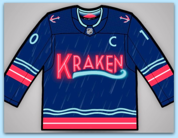
Kraken ‘Pike Place Market’ Remix
On his Instagram page, “aj.glass.designs,” a “College Student & Graphic Designer,” received inspiration from the famous Pike Place Market “Public Market Center” sign. He also wasn’t afraid of a little rain.
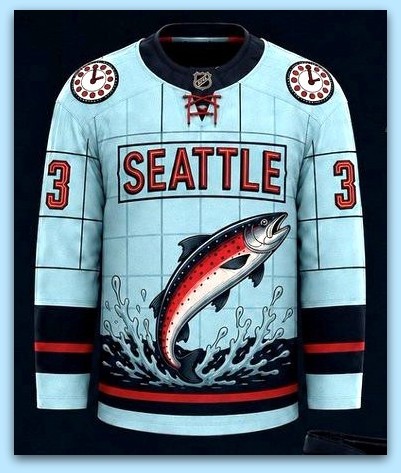
Seattle ‘Salmon’ Remix
Something’s fishy about this one, as the fictional sea monster has been replaced.
Nick Lee (@NickLee51 on X) would like to yeet this design right onto Kraken players, while also incorporating a bit of Pike Place Market as well. “Highly doubt they do it,” writes Nick, “but (here’s) my submission for what the Seattle Kraken ‘Hometown Remix’ uniform should look like.”
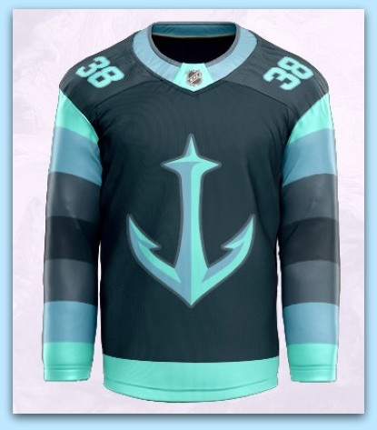
Kraken ‘Anchor’ Remix
We’ll let “LukeOrient,” a “Graphic Designer / Logo Craftsman / Color Technician” on Instagram, describe his design.
“The Kraken take inspiration from their predecessors. On a deep navy base, we see the fan favorite secondary mark receiving primary treatment. The striped sleeves are inspired directly from the old Seattle Metropolitans. The unique Kraken number font shifts to the shoulders to de-clutter the sleeve design.”
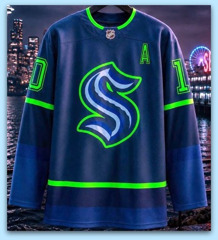
Kraken ‘Ocean Blue’ Remix
Drew Martin of dm.graphic.design.co posted a sweater accented with vibrant neon green.
On Instagram, he wrote, “This Kraken hometown remix jersey uses deep ocean blue colors and a bright green color scheme to represent the city and team.”
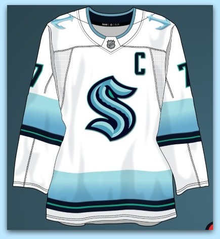
Seattle ‘Get The Red Out’ Remix
Our final entry comes from “Patchey13,” another poster on the SportsLogos message boards.
Patchey explains, “I decided to go extremely bright. I completely removed the red from the entire set, and replaced it with the equivalent of the “glow in the dark” greenish color in their alternates. Overall I think the color scheme gives off the vibe of a bright, overcast day on the water in the Pacific Northwest, and is a great fit within Seattle’s overall brand while going in a completely different direction.”
Earlier Seattle:
— Seattle’s Opening Week 4-in-6 Is A Bear
Earlier Canucks:
— Oh Yes! Early Kraken, Canucks Pacific Division Predictions