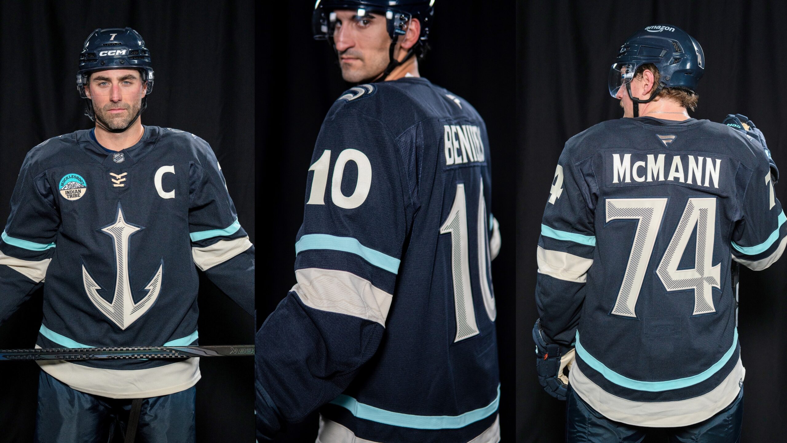

Five-plus years of playing second fiddle as Seattle Kraken logo is over for the anchor, as of Monday. The Kraken, like all 32 NHL teams, presented its “Hometown Remix” uniform, with the anchor as the primary crest.
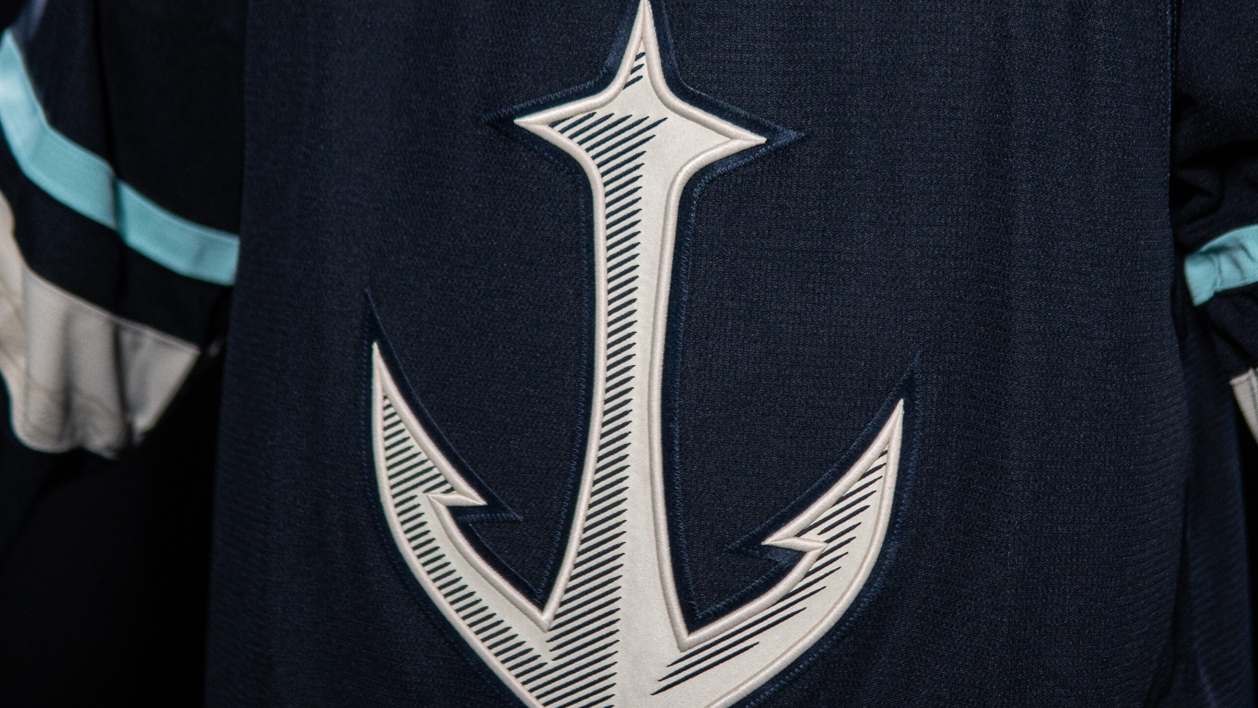
From a team release: “Fans have been asking to see more of the anchor logo since its debut, and we’re thrilled to answer their call.” Other design features:
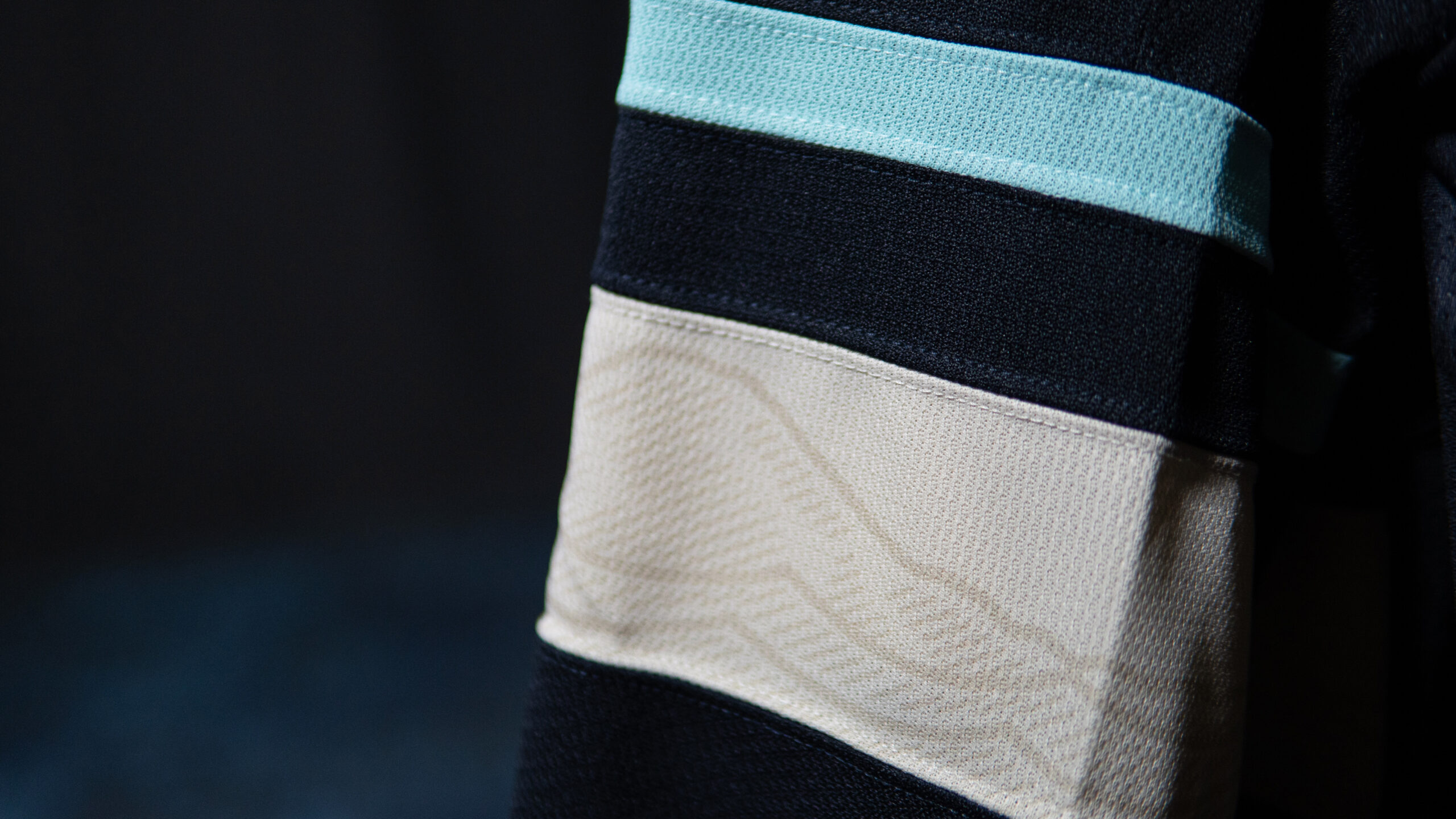
- Sleeve artwork features Puget Sound framed by mountains, including Mount Rainier.
- Rhododendrons, Washington’s state flower, line the hem.
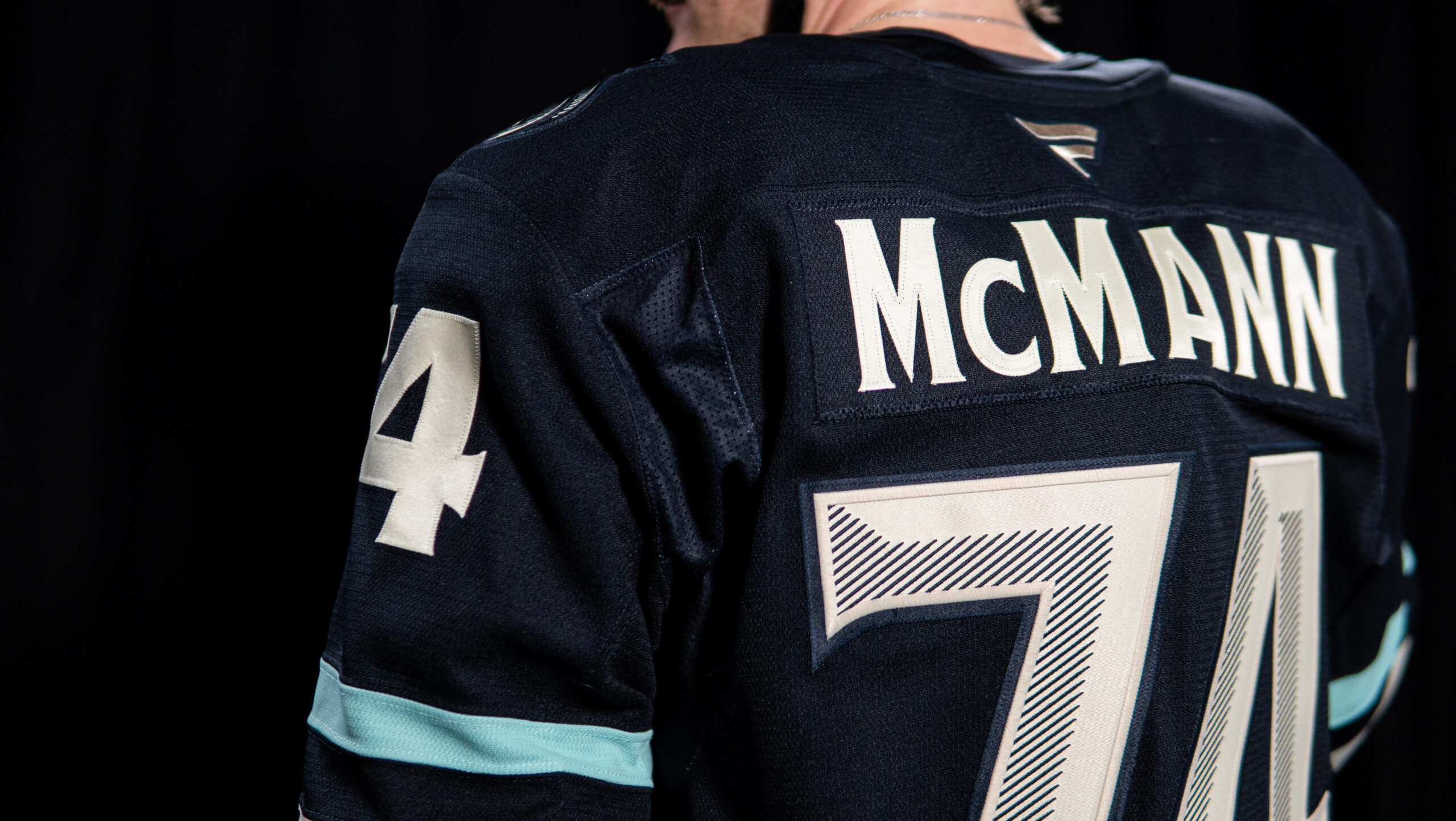
- Custom lettering and numbers.
- Embroidery inspired by nautical scrimshaw.
- Midnight blue, ice blue, and cream colors.
Remixes Will Be One-Season Wonders
“Hometown Remix is the first special edition uniform, apparel and headwear program designed and developed by Fanatics since becoming the league’s on-ice uniform outfitter in 2024.”
Initial sales are booming, according to Sports Business Journal. “The Hometown Remix uniforms are already the league’s largest-ever leaguewide collection by advance orders. Initial orders totaled more than four times those of the league’s Reverse Retro 2.0 collection with Adidas for the 2022-23 season.
“Like both Reverse Retro campaigns, the Hometown Remix jerseys will only be around for a limited time, with teams hanging them up after the 2026-27 season.”
How To See Kraken Remix Uniforms In Action
The Kraken will wear these new jerseys at six home games, starting this Wednesday, Nov. 4 against the Calgary Flames. The other dates:
- Saturday, Nov. 28 vs Edmonton
- Saturday, Jan. 2 vs Islanders
- Sunday, Jan. 3 vs Vancouver
- Saturday, Feb. 13 vs St. Louis
- Monday, March 15 vs St. Louis
Everyone Has An Opinion
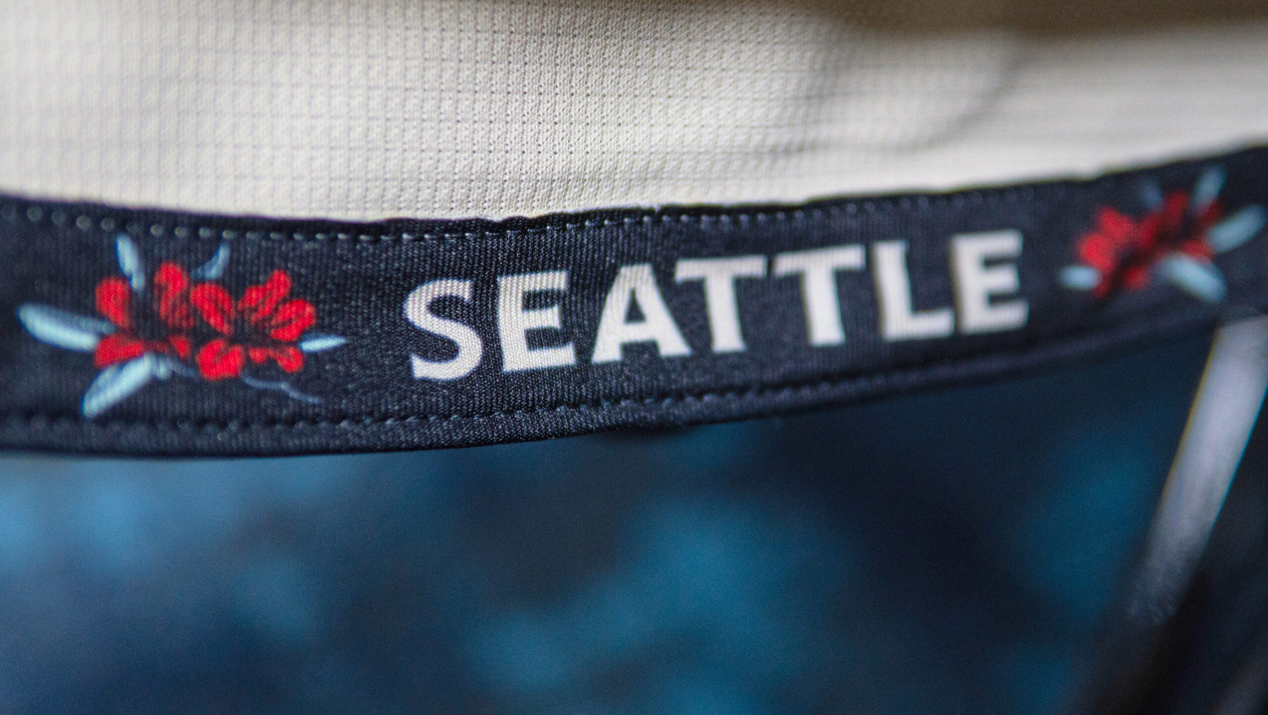
Apropos for the day before a midterm election, everyone has an opinion on the new jerseys, and no one agrees with anyone else.
“The primary ethos of the Hometown Remix project is to connect the jersey to the city,” said ESPN’s Greg Wyshynski. He ranked the Kraken version 16th.
“Speaking of secondary logos that maybe deserve more prominence, the Kraken take their ‘Space Needle-as-anchor’ logo from the shoulder to the front of the sweater, and it looks iconic. One can never have enough scrimshaw. There are a lot of other local details on these, from a nod to Mt. Rainier on the sleeves to rhododendrons on the hem.”
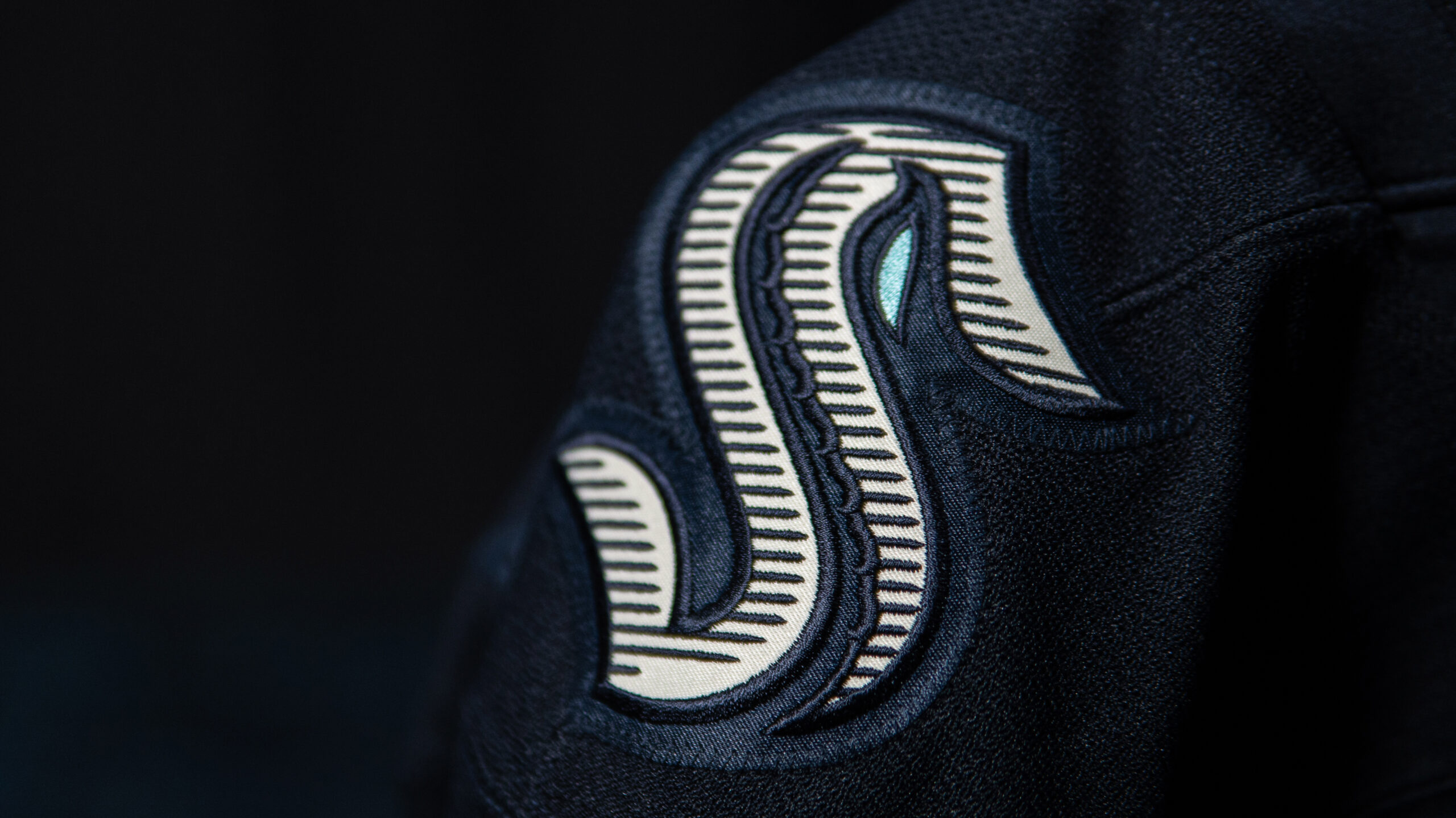
USA Today ranked the Kraken kit 5th best. “The anchor, the sleeves… yes!” The Score was less impressed, placing Seattle at #20. “Using the same color as the Kraken’s primary home jerseys makes these a letdown.”
Social Media Reaction To Hometown Remix
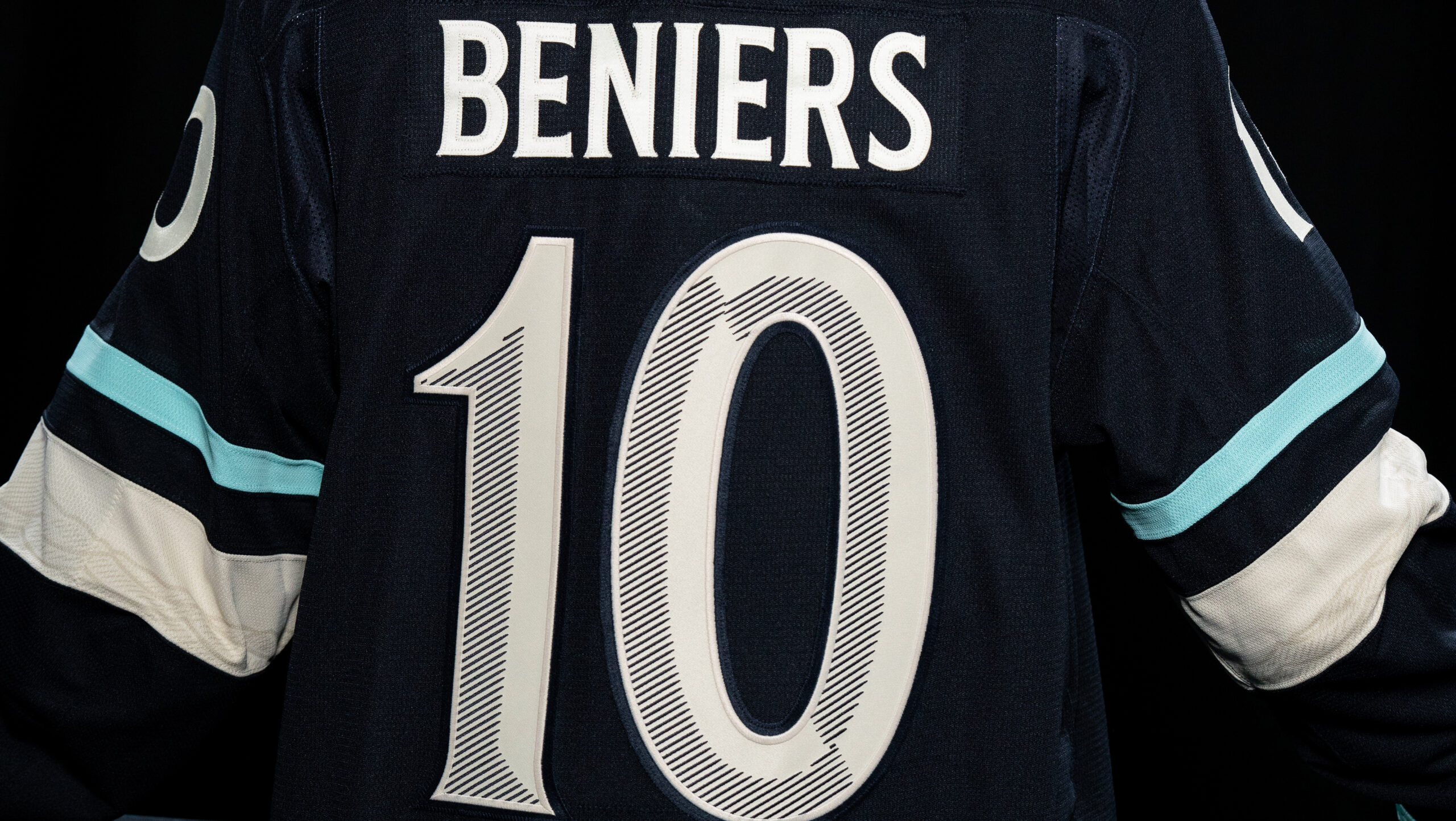
“THEY NAILED THESE !!!”
“10/10 banger, easily a top 5 jersey of this league initiative.”
“Anchor logo is best logo.”
“They could’ve used a little touch of red. Little pop. But 98% perfect.”
“Simple, but the details with the mountains, old school collar laces, and the ANCHOR!!! Love it.”
“I still wish it was some bold new color instead of another blue jersey.”
“I was really hoping for a deep green accent as a callback to other Seattle sports.”
“I do wish the mountains hidden in the cream detailing were more obvious.”
“Should have given the S the red eye on the shoulder or some red piping.”
“The Kraken branding team literally cannot miss.”
Timing, as they say, is everything. One longtime Kraken mainstay just missed out on a chance to wear one (unless he buys one like the rest of us). He doesn’t get to go to Finland, either (unless he buys a ticket like the rest of us).


